136
rated 0 times
[
140]
[
4]
/ answers: 1 / hits: 25724
/ 6 Years ago, fri, april 27, 2018, 12:00:00
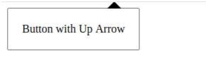
I want to give the material-ui popover this following shape shown in the image.
I have created the popover working Demo using react and shared the link for editing purpose. Any help ? => Working Demo
I'm Sharing the code here also but it would be good if the stackblitz working demo would be in use for editing purpose:
import React, { Component } from 'react';

import Popover, {PopoverAnimationVertical} from 'material-ui/Popover';

import Menu from 'material-ui/Menu';

import MenuItem from 'material-ui/MenuItem';

import MuiThemeProvider from 'material-ui/styles/MuiThemeProvider';

import { render } from 'react-dom';

import Hello from './Hello';

import './style.css';


const PopoverStyle = {

    top: '50px'

};


class App extends Component {


  constructor(props) {

        super(props);

        this.state = { pop_open: false };

    }


  handleProfileDropDown(e) {

        e.preventDefault();

        this.setState({

            pop_open: !this.state.pop_open,

            anchorEl: e.currentTarget,

        });

    }


    handleRequestClose() {

        this.setState({

            pop_open: false,

        });

    };


  render() {

    return (

      <div>

      <MuiThemeProvider>

        <button type=submit name={this.state.name} onClick={this.handleProfileDropDown.bind(this)} >My Customized PopOver</button>

        <Popover

                      open={this.state.pop_open}

                      anchorEl={this.state.anchorEl}

                      className=popover_class

                      style={PopoverStyle}

                      anchorOrigin={{horizontal: 'left', vertical: 'bottom'}}

                      targetOrigin={{horizontal: 'left', vertical: 'top'}}

                      onRequestClose={this.handleRequestClose.bind(this)}

                      animation={PopoverAnimationVertical}

                    >

                      <Menu>

                        <MenuItem primaryText=Content />

                        <MenuItem primaryText=My Profile />

                        <MenuItem primaryText=Settings />

                        <MenuItem primaryText=Logout />

                      </Menu>

                    </Popover>

            </MuiThemeProvider>

      </div>

    );

  }

}


render(<App />, document.getElementById('root'));
More From » reactjs