Example page source:
<!DOCTYPE html>

<html lang=en>

<head>

    <meta charset=UTF-8>

    <meta name=viewport content=width=device-width, initial-scale=1, maximum-scale=1, user-scalable=no>

    <title>Page</title>

</head>

<body>

<div class=main style=height: 100%;>

    <div class=header style=height: 100px; background-color: green;></div>


    <iframe src=http://www.wikipedia.com

            style=height: 200px; width: 100%; border: none;></iframe>


    <div class=footer style=height: 100px; background-color: green;></div>

</div>

</body>

</html>
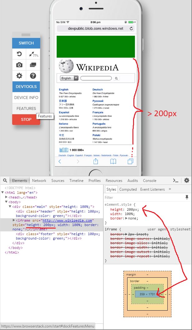
The problem is, that height of 200px from the IFrames inline style is ignored on mobile safari:
Also I'd like to change the height of the IFrame dynamically via vanilla JavaScript which is not working at all with the following code:
document.getElementsByTagName('iframe')[0].style.height = 100px
The value of the height style is changed correctly according to the dev tools but it's simply ignored since the actually rendered height of the IFrame doesn't change.
This only seems to be a problem in mobile Safari and is working as expected on the latest versions of desktop Safari, Firefox, Chrome, Androids WebView etc.
Testpage: http://devpublic.blob.core.windows.net/scriptstest/index.html
Ps.: I tested this with various devices on browserstack and also took the screenshots there since I don't have no actual iDevice at hand.