12
rated 0 times
[
15]
[
3]
/ answers: 1 / hits: 99562
/ 11 Years ago, wed, october 16, 2013, 12:00:00
I have a Modal Popup (Bootstrap) which displays content based on the user selection
This is the javascript code that i've used to check for the users selection
PlayerMP.getFunctionalDetails = function (type, UserID, SessionID, SessionNo) {

$.ajax({

    type: GET,

    url: PlayerMP.URL,

    data: rt=4&type= + type + &UserID= + UserID + &SessionID= + SessionID + &SessionNo= + SessionNo,

    success: function (FunctionalSplitsJS) {

        if (FunctionalSplitsJS.indexOf(SessionExpired=1, 0) == -1) {


            $(#divFunctionalDetails).html(FunctionalSplitsJS);

            switch (type) {

                case 1:

                    $(#divFunctionalsSplit);      //the table goes out of the modal window

                     break;

                case 2:

                    TallyFunctionalSheet();

                    $(#divFunctionalsSplit);

                    break;

                case 3:

                    $(#divFunctionalsSplit);

                    break;

            }


             $(#divFunctionalsSplit).modal('show');

        }

        else

            window.location.href = ../Login.aspx?SessionExpired=1;

    }

});

}
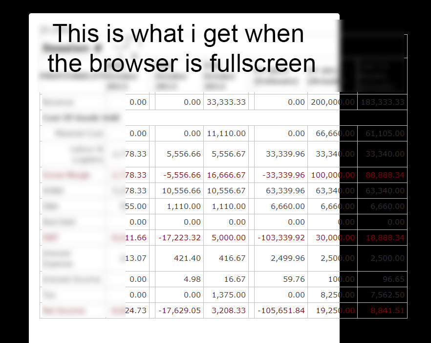
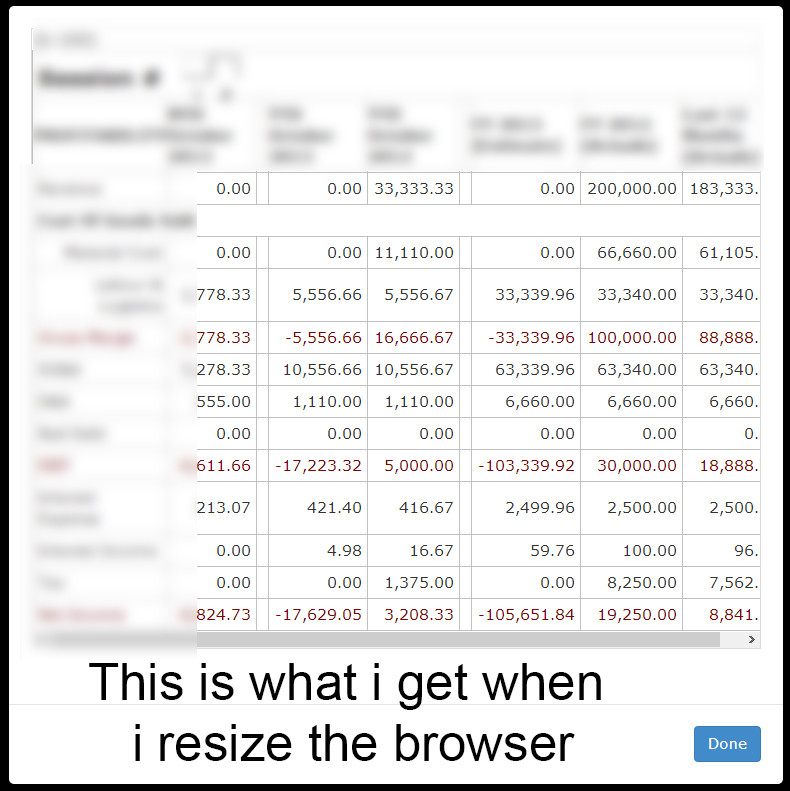
- The first case has a table which is supposed to be displayed inside the modal popup but the table goes outside the modal window (there is a problem with the width of the modal window but the
table-responsiveseem to be working) But when i resize the browser to match the width of the tablet the table/modal auto resizes to match each other. - The width of the 2nd and the 3rd case's of the modal seem to work fine.
This is the code for the modal window thats being called
 <div class=modal fade id=divFunctionalsSplit tabindex=-1 role=dialog aria-hidden=true>

        <div class=modal-dialog>

            <div class=modal-content>

                  <div class=modal-body>

                    <div class=table-responsive>

                        <div id=divFunctionalDetails></div>

                      </div>

                   </div>

                   <div class=modal-footer>

                   <button type=button class=btn btn-primary data-dismiss=modal>Done</button>

                   </div>

            </div>

        </div>

 </div>
- Fullscreen Browser
- Resized Browser
More From » css